Logos
Consistency is the key to establishing any brand. Please follow these basic guidelines when using the NRAO logo.
Spacing (3 logos)
In accordance with the brand guidelines provided by NSF, many use cases require the NRAO logo to be used in combination with the NSF and AUI logos.
When such cases occur, please use the below logo file with the spacing shown in the example.
Spacing (2 logos)
In some instances, it is only required to have the NSF and NRAO logos as provided below.
Note: When using NSF and NRAO logos only, notice the reduced distance between logos to two units in the example.
Color Options
There are several different color versions of each logo. The options seen here are the prefered colors. When utilizing a non-white background, choose the color that provides the highest level of contrast.
For more information on colors and contrast, see those style guide sections repectively.

Preferred line height minimum: .75 in or 20mm
Absolute minimum: .50 in or 13mm
Formats & Scale
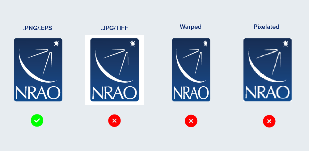
It is very important that you pick the proper file for your application. For example, if you are placing the logos over a non-white background you should be using a .PNG file with a transparent backgound, or a vector-based option such as an .EPS or .AI file (Adobe Illustrator). The subtle rounded corners on the NRAO logo should not have white corners.
It’s also very important to scale logos proportionally – don’t stretch. Also, when scaling logos for use in applications where the logos will be very large, such as signage or trade show graphics, alway use a vector-based option. It will scale without the risk of pixelation.

Not sure what logo to use for your project? Please contact us with your questions!
Co-branding
Follow the established order, spacing, and scale when incorporating partner logos. If more than one partner is included, assemble in alphabetical order starting after NRAO logo. Maintain consistent spacing between logos and keep height consistent.

Minimum logo height: .75 in or 55px or 20mm
Questions? Contact Us
In addition to the resources found here, you can contact the Education and Public Outreach team for questions regarding the use of branding elements or templates in the public.


