Visual Style
Primary Palette
A little goes a long way. Our primary color is the classic Pantone 280. This and the secondary pallettte are to be used for elements such as backgrounds, graphic highlights, text, lines, etc. See page 9 for a separate pallette that has been adopted for science illustrations.
You might noticed that our website utilizes a subtle gradient. This is a nice background element that adds a little flare when used in larger areas.
Note: This gradient should not be used when product is going to be printed conventionally without first consulting printing vendor.
HEX: 004990
CMYK: 100 85 0 39
HEX: 004990
CMYK: 100 85 0 39
HEX: 012e57
CMYK: 83 38 7 0
Secondary Palette
Choose from this variety of contrasting colors to create areas of emphasis. Highlighted text would use the (bright blue Pantone 306) option or white. Straight lines that are use to label should be white or black, depending on contrast requirements.
HEX: 00B5E2
CMYK: 76 0 0 0
HEX: FFB549
CMYK: 0 28 79 0
HEX: FF6A39
CMYK: 0 68 85 0
HEX: 002C55
CMYK: 100 46 0 70
HEX: #FFF
CMYK: 0 0 0 0
HEX: B94700
CMYK: 0 77 100 14
HEX: #000
CMYK: 0 0 0 100
Artist Impressions & Science Images
The ultimate goal is to create photo-realistic illustrations of cosmic phenomenon. Follow these guidelines for illustrations and animations of science results and artist impressions:
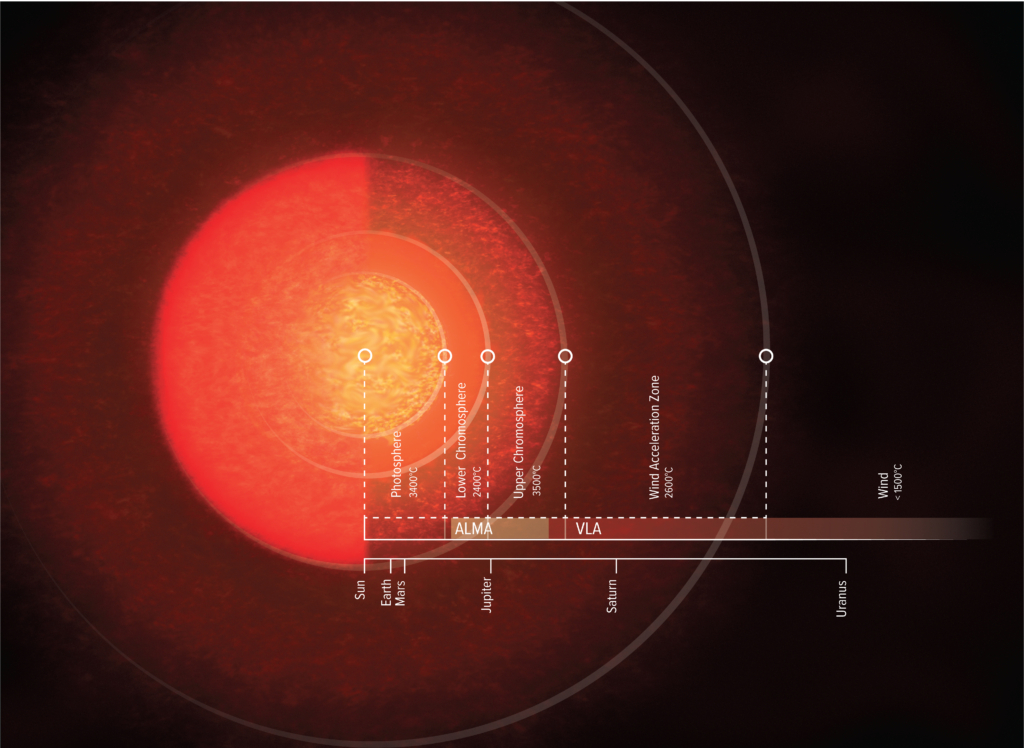
Gas: Render in warmer (hot gas) or cooler (cold gas) colors depending on type of gas being visualized
Dust: Render in earth tones or neutral colors to give a natural appearance
Exoplanets: Render in natural tones. Avoid surface recognizable details that exist in our Solar System planets
Molecules: Render using a modified CPK color chart using appropriate size and bond ratios. CPK colors tend to be over saturated and not reproducible in CMYK. Modify CPK suggestion such that saturation level remain in gamut. Update “NRAO Swatch Library” as new colors are created.
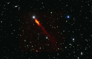
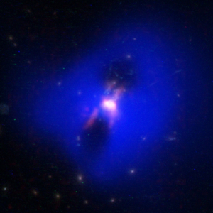
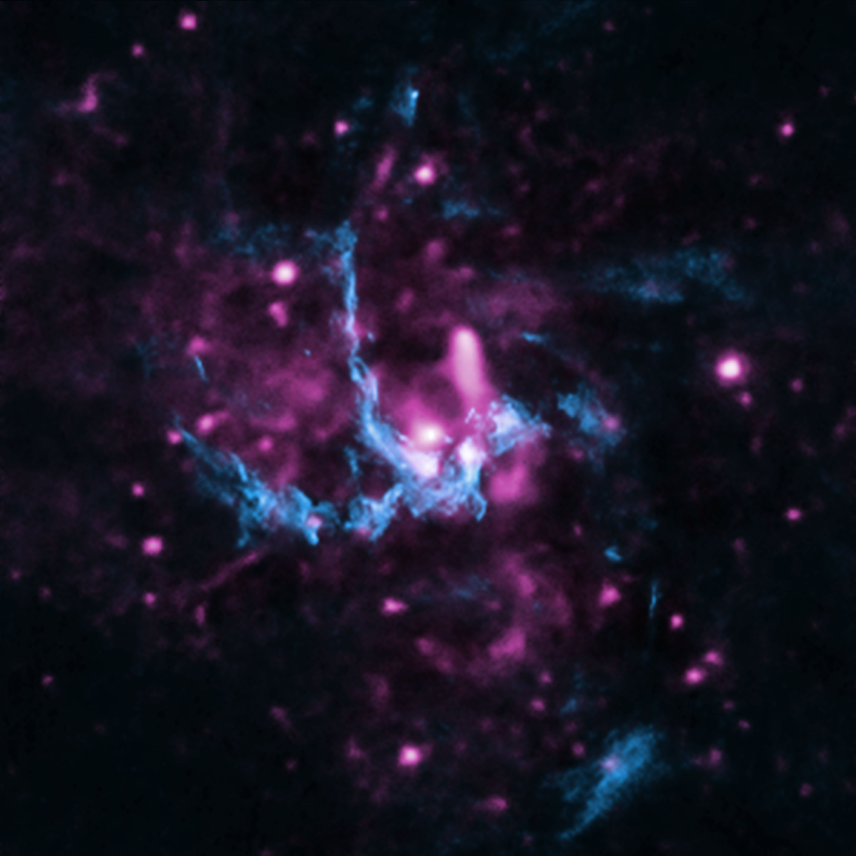
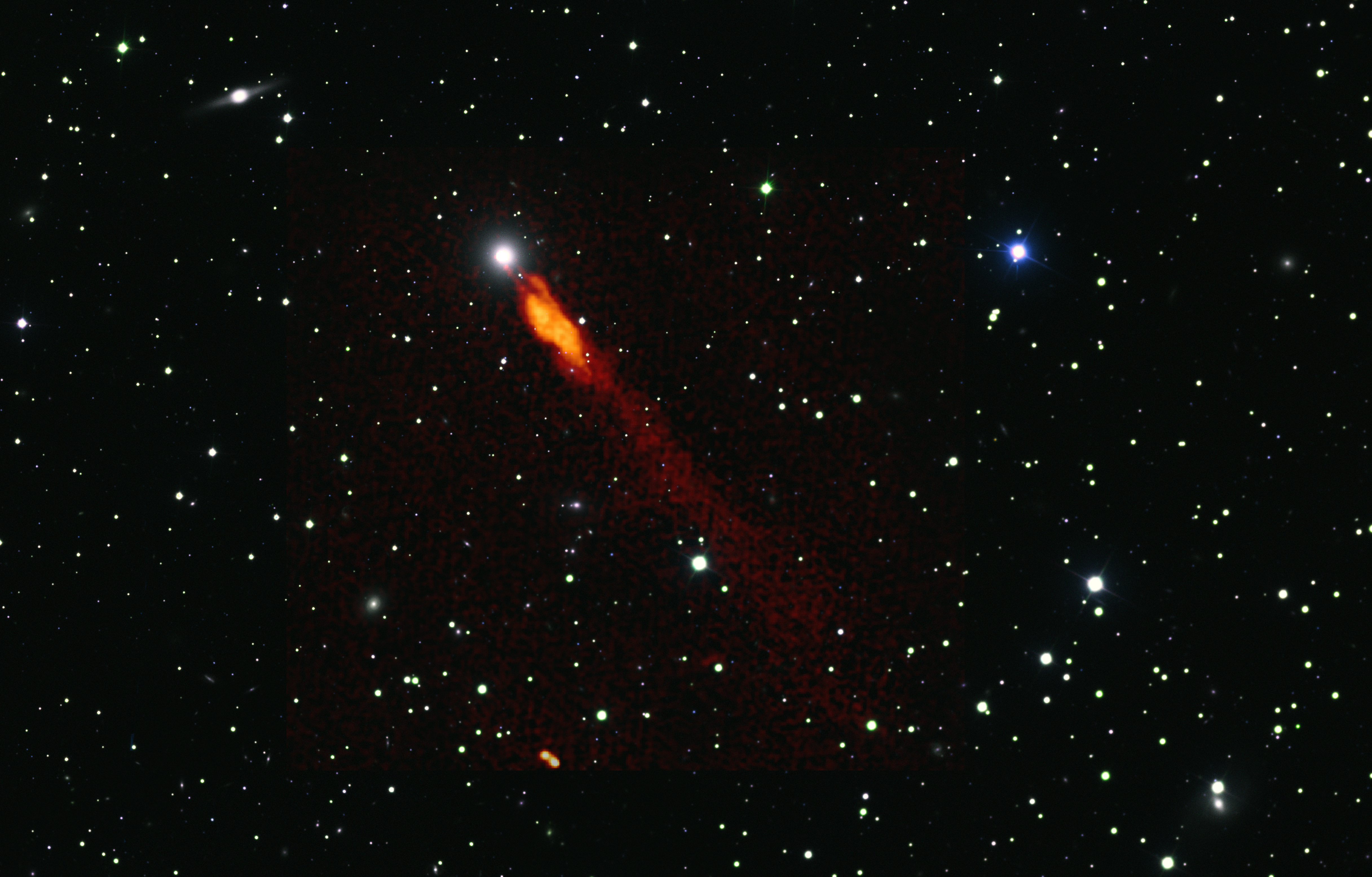
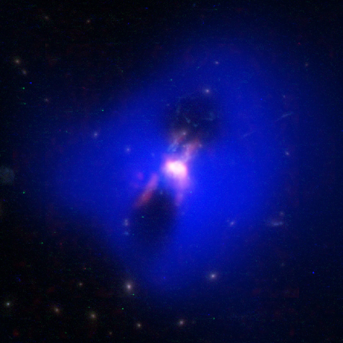
Multi-wavelength: Render radio data in red when combining with multiple wavelengths. See page X
Note: Utilize an established “NRAO Swatch Library” to standardize palette. See artists for more information.


Diagrammatics
Follow these guidelines for diagrams, infographics, and technical illustrations:
Color: Use primary an secondary color palettes for infographics. For general/technical illustrations, simulate natural color of object when possible. Revert to primary and secondary color pallets when combining dissimilar objects. Keep contrast and depth in mind. Use lighter colors to increase attention.
Lines: Keep line weight to a minimum, and rely on fills to create shape.
Labels: Use simple, clear formatting. Focus should remain on the illustration.
Complexity: While details can bring an illustration to life, they can also kill it when the production method of the final product can’t support intricate elements. For example, the RAP embroidered patch (far right) required a much simpler illustration that could be embriodered. However, the highly-detailed version of the antenna (right) was perfect for large on-site signage.
For more examples of infographics, check out our gallery collection.
Contrast
PRO TIP: View your poster in black and white (gray scale) to be sure there is enough contrast between colors. Avoid placing complementary colors together (orange and blue, red and green, yellow and violet).

Questions? Contact Us
In addition to the resources found here, you can contact the Education and Public Outreach team for questions regarding the use of branding elements or templates in the public.