Typography
Fonts (Primary)
EPO adopted Proxima Nova as the primary type family based on its large variety of weights and options. Guidelines on usage along with some examples to follow.
Use Examples:
General Use
Posters, brochures, infographics, signage, etc.

Proxima Nova
A super font with lots of weights
An international team of astronomers has discovered the most distant quasar yet found — a cosmic monster more than 13 billion light-years from Earth powered by a supermassive black hole more than 1.6 billion times more massive than the Sun and more than 1,000 times brighter than our entire Milky Way Galaxy.
An international team of astronomers has discovered the most distant quasar yet found — a cosmic monster more than 13 billion light-years from Earth powered by a supermassive black hole more than 1.6 billion times more massive than the Sun and more than 1,000 times brighter than our entire Milky Way Galaxy.
An international team of astronomers has discovered the most distant quasar yet found — a cosmic monster more than 13 billion light-years from Earth powered by a supermassive black hole more than 1.6 billion times more massive than the Sun and more than 1,000 times brighter than our entire Milky Way Galaxy.
An international team of astronomers has discovered the most distant quasar yet found — a cosmic monster more than 13 billion light-years from Earth powered by a supermassive black hole more than 1.6 billion times more massive than the Sun and more than 1,000 times brighter than our entire Milky Way Galaxy.
An international team of astronomers has discovered the most distant quasar yet found — a cosmic monster more than 13 billion light-years from Earth powered by a supermassive black hole more than 1.6 billion times more massive than the Sun and more than 1,000 times brighter than our entire Milky Way Galaxy.
An international team of astronomers has discovered the most distant quasar yet found — a cosmic monster more than 13 billion light-years from Earth powered by a supermassive black hole more than 1.6 billion times more massive than the Sun and more than 1,000 times brighter than our entire Milky Way Galaxy.
Fonts (Secondary)
Proxima Nova also comes in a condensed version. While used infrequently, it does have it’s place in documents or products that require a very high word count, like the NRAO Annual Report. Keep in mind that there is a risk of reduced readability, particularly in the smaller font sizes.
Use Examples: Open Captions The open captions utilized bright blue, bold text to highlight key concepts. See page X Annual Report Utilizing the condensed version allow the page count to be minimized without cutting content.
Proxima Nova Condensed
An option for products with high word count requirements

Fonts (Alternate)
If you are unable to use Proxima Nova for any reason, Open Sans serves well as an open source alternative.
Open Sans
An open source font alternative when the primary fonts aren’t available.
Sizes
Use type to establish a hierarchy. Type can also work as a graphic/design element.
Follow this basic text scale rule:*
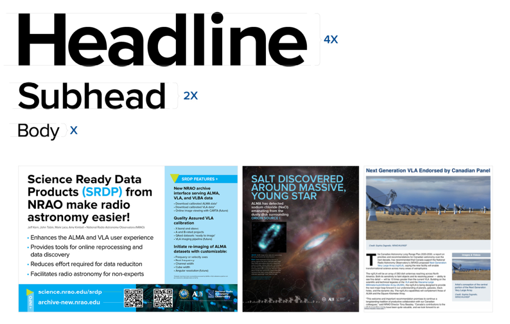
Headline = 4X
Subhead = 2X
Body = X
If you find yourself with a large amount of text (even after some major editing) scale from the body text up to get the appropriate size headline.
*It’s more of a guideline, really. Adjust as needed.
Keep in mind the goal is to guide the viewer or reader by establishing a visual hierarchy
Type Treatment
Use a design hierarchy and headline-style copy that communicates a complete idea. Incorporate articles and conjunctions as smaller graphic elements if needed.
Examples:
Title Treatment and Thumbnail
Be sure to use establish typography standards and include branding on frame used as thumbnail (poster frame).
Annual Report
Utilizing the condensed version

Create Contrast
Proxima Nova was choosing because of its large variety of weights and styles. It provides more options to create contrast between headlines, subheads, body, captions, and references.
Skip weights (light > semibold > extrabold) to create additional contrast, but avoid over-use of bold fonts.
Frequently, the difference between weights can be hard to recognize. You can create more contrast by choosing weight combinations such as Light and Semibold or Regular and Bold.
But remember, the idea is just to emphasize one over the other, if everything is bold – nothing is emphasized.
Aa
Aa
Aa
Aa
Aa
Aa
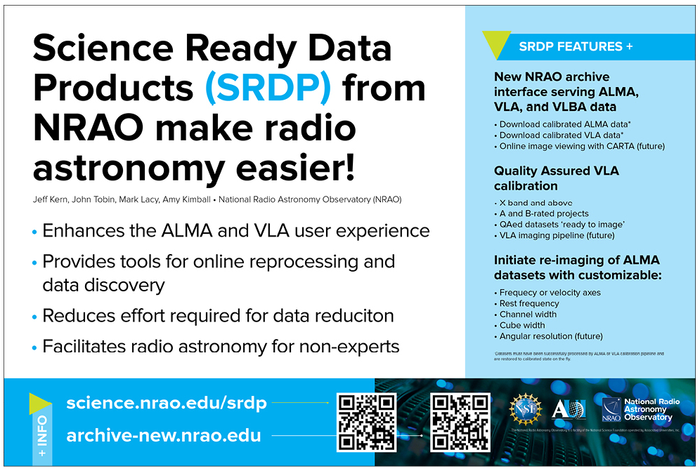
Example (SRDP Poster)
Originally created by NRAO SRDP team for the 2020 AAS conference. This poster (below) uses an existing template and is pretty well organized and fairly concise.
Scale text in order to create a hierarchy that leads viewer through your poster.
Same poster with minor text modifications (redundant headline eliminated) and slight reorganization of information. Color palette simplified and hierarchy applied to text layout.
Addition of QR codes provide links to additional information, and simple graphic elements create a sense of motion and highlight certain features.

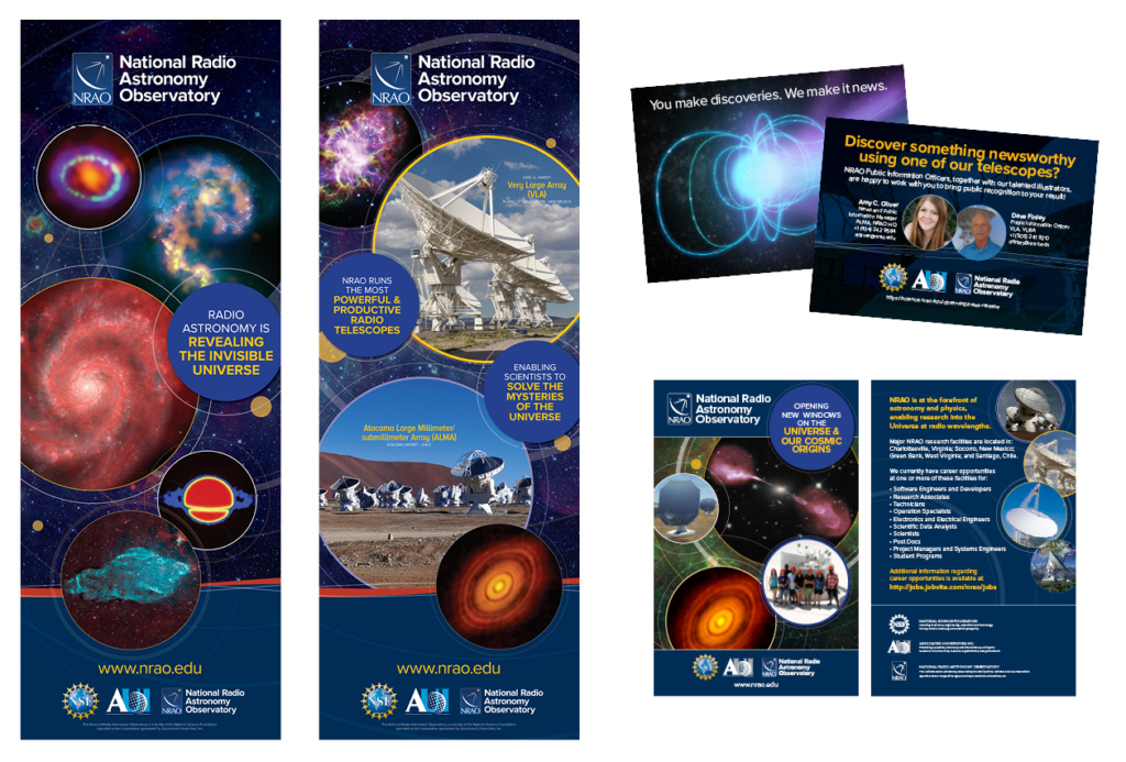
Event Graphics
The circles are a nod to antenna shape, orbits, discs, super nova remnants, etc. The also represent cycles and the never-ending pursuit of knowledge and excellence, as well as the synergy between our different facilities and staff. Overlapping text bubbles also highlight the connections between the different facilities and our common goals and values.
Use Examples:
HR Pop-Ups
Primarily used by HR during recruiting events, the stand-alone NRAO logo was added in order to reduce the confusion the three logos can cause.
Science Conferences
Graphics are also used at conferences and STEM events.
Note: When using science images, attempts should be made to include a variety of results from each facility.
Videos & Animations
Videos and animations should follow the same color schemes as their non-animated counterparts. Open captions should follow the guidelines shown on the right. Music, when utilized, should not overwhelm any spoken dialogue, and hard cuts should be employed as much as possible. Cuts should also be synchronized with soundtrack if possible.
Example: https://vimeo.com/280796493
Labeling of graphics with small text should be avoided to reduce risk of readability issues. Utilize caption content and highlighting instead.
Use Examples:
Open Captions
The open captions utilized bright blue, bold text to highlight key concepts.
Annual Report
Utilizing the condensed version allow the page count to be minimized without cutting content.
Questions? Contact Us
In addition to the resources found here, you can contact the Education and Public Outreach team for questions regarding the use of branding elements or templates in the public.